This section describes how the ImageCollection part is used within the CMS in order to add individual images to pages/content items. Multiple image parts can be added to Content Types as required, but if the goal is to insert a series of related images we recommend using the ImageCollection part instead.
Content Type Settings
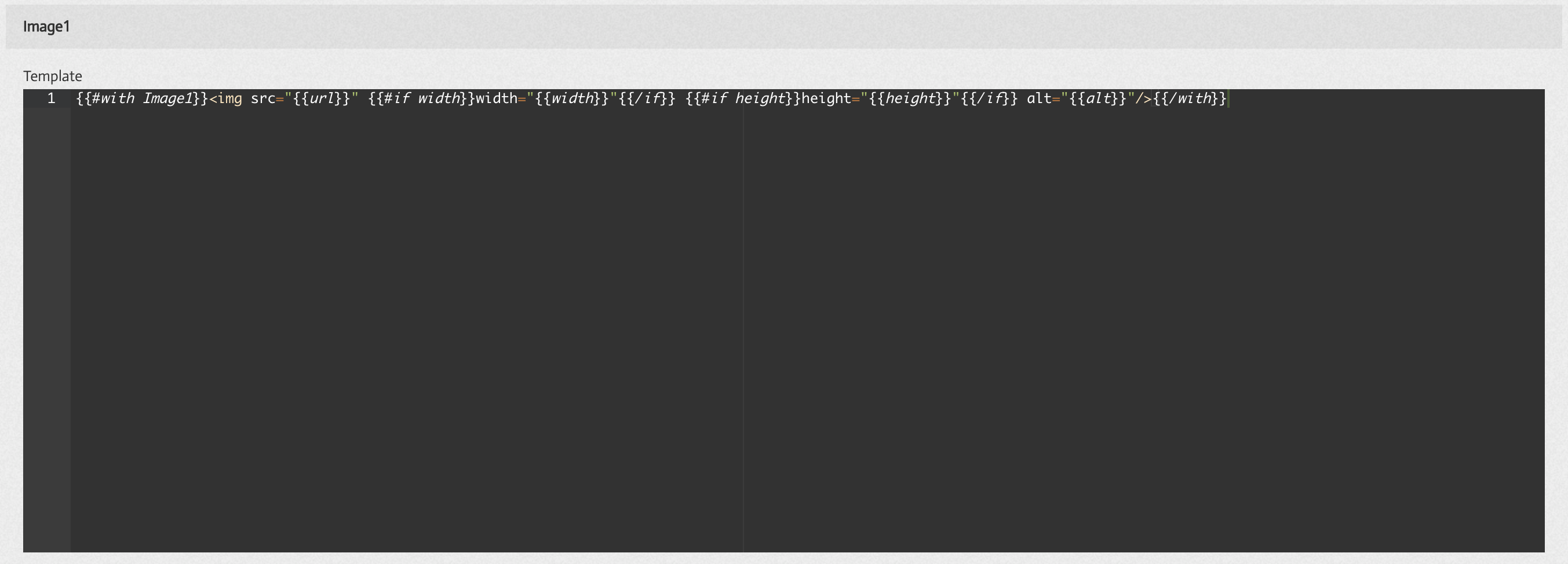
Whenever an Image part is added to a Content Type the following 'default' template section is added to the Content Type Settings tab. In the example image below the Image part added has been named 'Image1'. The default/template code entered into the Part Settings section (as shown below) can then be included in each Content Type Template or it can be overwritten to modify the implementation (if required).
In the default template above the following handlebars tags are used.
{{#with Image1}} [code to render out the image] {{/with}} - here the #with statement is used to provide the relevant context to all code inside the opening #with and closing /with statements. Using a #with block like this allows you to directly reference parts of the Image e.g. {{url}}. Without wrapping the image section in a #with block you could still reference the images url, but you would need to use a fully qualified reference e.g. {{Image1.url}}.
Within the Image part 4 elements can be used
The image url - accessed by {{url}}
The image width property - accessed by {{width}}
The image height property - accessed by {{height}}
The image alt text property - accessed by {{alt}}
Note
All 4 of the image properties are optional, i.e. they may or may not be completed by the CMS user. Therefore, it is advisable to design the template to accommodate for all or some of these properties being missing.
Content Item Settings
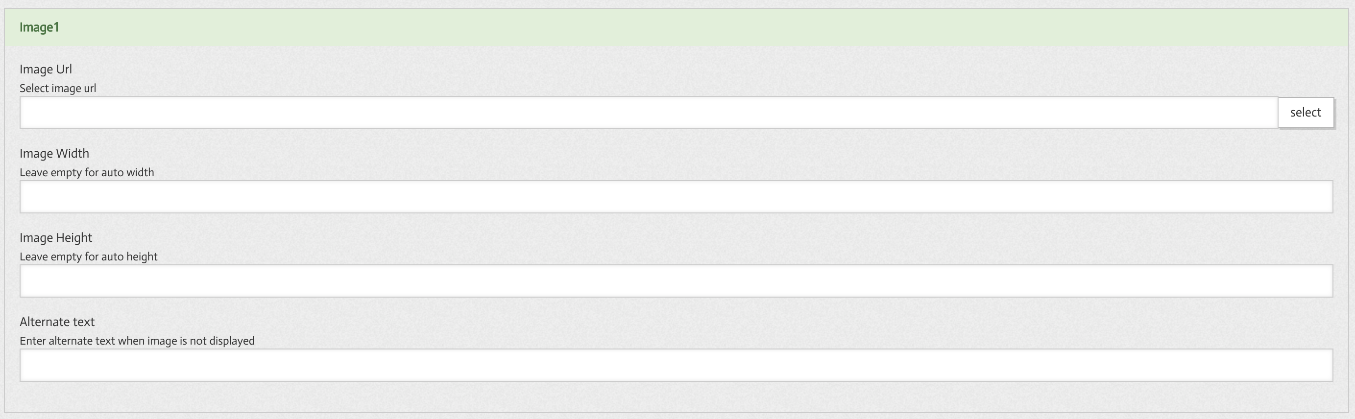
Image URL
The Image URL field requires image path to be entered. This can be a relative path - pointing to an image stored within the CMS, or a fully qualified URL path pointing to an external image.
The select image control allows for images stored within the CMS images folder and locally stored images to be easily added.
Image Width
The image width input is used to restrict the width of an image (if required). This is not typically required as CSS is in most cases used to control the display of images within the site.
Width values can be entered in either % or pixel amounts - e.g. 100% or 320px
Image Height
The image height input is used to restrict the height of an image (if required). This is not typically required as CSS is in most cases used to control the display of images within the site.
Height values can be entered in either % or pixel amounts - e.g. 100% or 320px
Alternative Text
The Alternative text field is used to populate the image alt tag attribute. If for any reason the image cannot be displayed then the alternative text entered will be displayed to the user.
It is good practice to provide alt text which accurately describes the content of the image.
Using the Part in Templates
Image parts can be used for a variety of reasons within a template. Image parts may be used for logos, icons, thumbnails, or stand-alone images.
All of the following code snippets could be used to insert an image called 'Image1' into a template.
<img src="{{Image1.url}}" /> - here only the image url field is used
<img src="{{Image1.url}}" alt="{{Image1.alt}}" /> - here both url and alt fields are used
{{#with Image1}} <img src="{{url}}" alt="{{alt}}" />{{/with}} - here a with statement is used to provide relevant context to the properties inside it.
{{#with Image1}} <img src="{{url}}" width="{{width}}" height="{{height}}" alt="{{alt}}" />{{/with}} - here width and height properties are also used
{{#with Image1}} <img src="{{url}}" {{#if width}} width="{{width}}" {{/if}} {{#if height}} height="{{height}}" {{/if}} alt="{{alt}}" />{{/with}} - here a conditional IF statement is used to insert the width and height properties only if a width and height property is provided by the CMS user.